
How to Design a Letterpad That Looks Professional
Published by Shoaib Ahmed · Updated October 2026
A letterpad is one of the quietest pieces of design a business owns. It does not shout like a banner or travel like a visiting card, yet every quotation, receipt, application and reply goes out on it. When it is done well, the reader barely notices; they simply feel that the business is organised. When it is done badly, the page looks crowded, the text collides with the logo, or the printer cuts off the address. This guide explains how to design a letterpad that works on paper and in real offices, using three designs from our portfolio as examples. Phone numbers, emails and some addresses are hidden in the images to protect privacy.
Remember what a letterpad is for
The most important fact about a letterpad is simple: most of it must stay empty. Someone will type or write on it. That means the design should work like a frame, with an identity at the top, contact details at the bottom, and a large clear space in the middle. A beautiful header that eats a third of the page is a bad letterpad, however good it looks on screen.
Example one: bold colour blocks
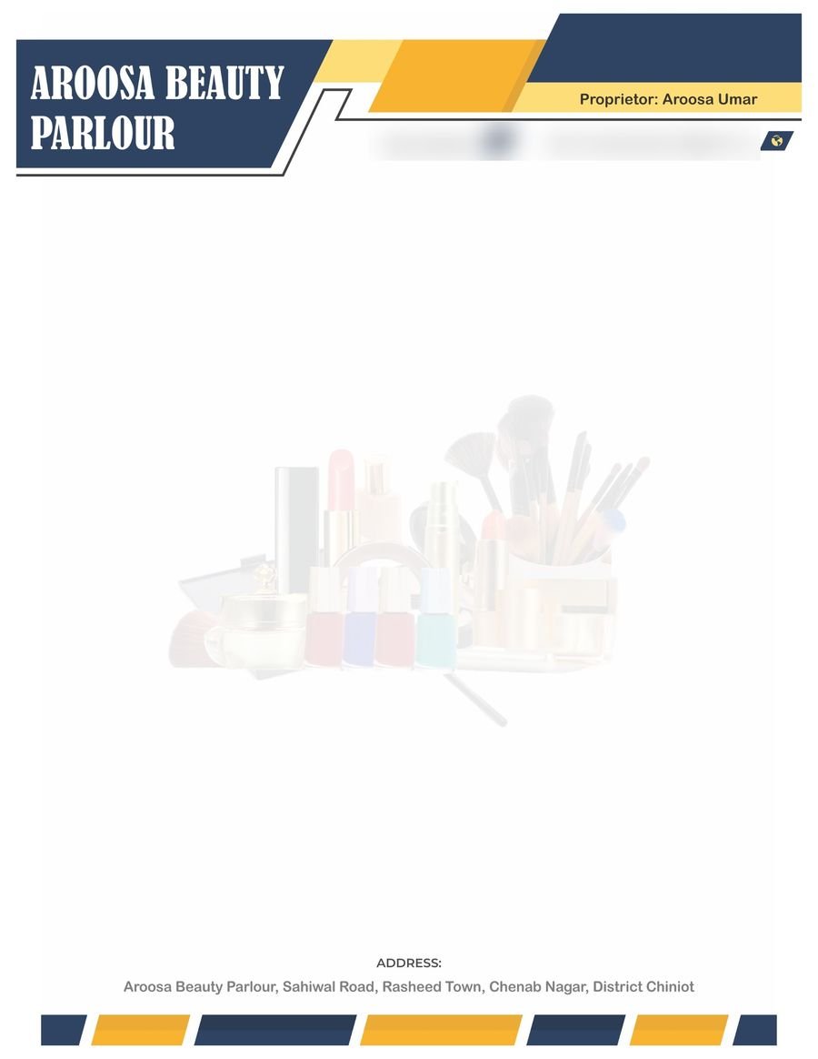
This design uses two strong colours, a deep navy and a warm yellow, in angled shapes across the header. The business name sits in white on the navy block, which gives it high contrast and makes it the first thing the eye finds. A title line and small icons for phone and email line up under the shapes, so the contact information is tidy and quick to find. The same angled pattern repeats as a thin strip at the very bottom, which ties the top and bottom of the page together and makes the layout feel planned.
In the middle, a very faint image of cosmetics acts as a watermark. This is a good technique when it is done gently: the picture suggests what the business does, but it is so pale that typed text stays readable on top of it. The golden rule for watermarks is to test them with real text. If you can see the picture clearly when words are printed over it, make it paler.
Example two: clean and corporate
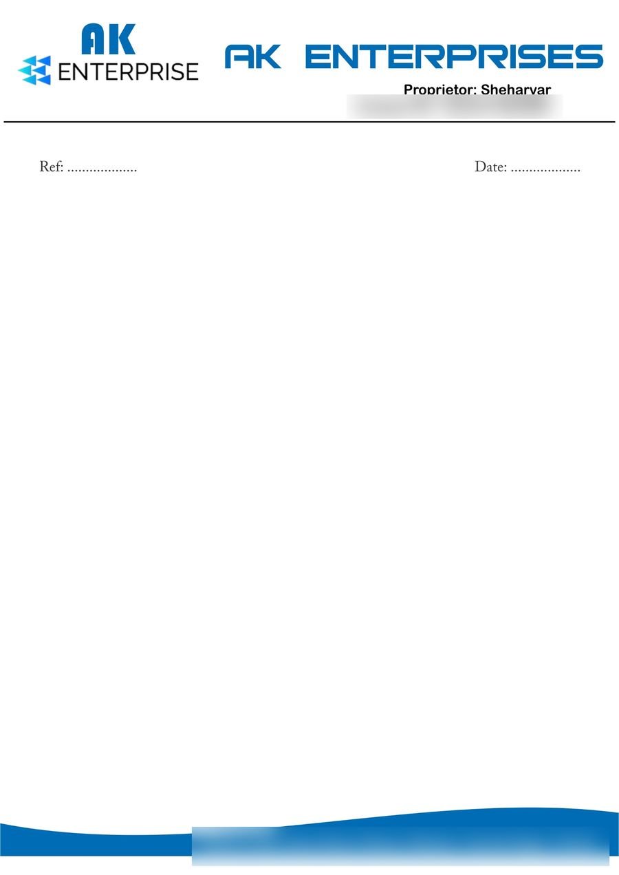
This one takes the opposite approach: mostly white, one colour, very little decoration. The logo and business name sit at the top, a thin black line separates the header from the page, and a blue wave at the bottom carries the address in white text. It also includes Ref and Date lines, a practical touch that makes the pad useful for official letters, since many offices number and date their correspondence. If your clients write formal letters, a reference line saves them from adding it each time.
The lesson here is restraint. A page like this prints cheaply, photocopies well and looks serious. The one thing to check on any design with a logo and a wordmark together is consistency: make sure the name is written the same way everywhere on the page, in spelling, capitalisation and style, so the business looks like one brand and not two.
Example three: a three-part footer
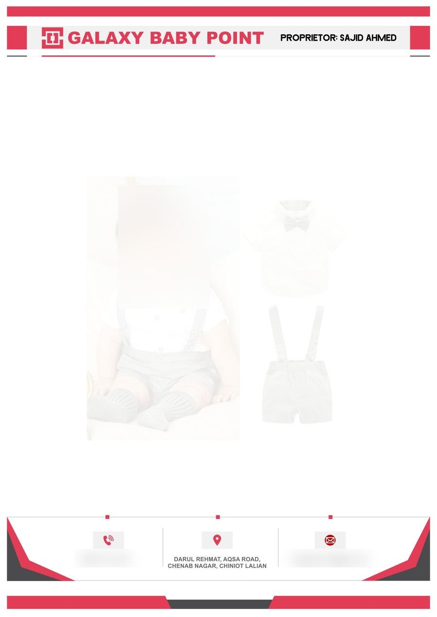
Here, the business name and proprietor sit in a single header bar, and all the contact details are grouped in a footer divided into three clear sections, each with its own icon: phone, location and email. Splitting the details like this is easy to scan, because the reader knows where to look without reading everything. Red and charcoal angles frame the footer and echo the red blocks in the header. A pale product image in the middle again hints at what the shop sells.
One practical reminder for any design with photographs: use images you have the right to use, and be especially careful with pictures of people, and children in particular. A faint watermark can still identify a person, and stock photos have licences. If you are not sure about an image, replace it with a simple illustration or leave it out.
Decide the header height early
A header that stays under about a fifth of the page leaves plenty of room for writing. Put the logo and name on the left or centre, and the proprietor or title on the right. If you have a lot to say, move secondary details, such as a list of services, into the footer rather than making the header taller.
Keep the writing area clean
Leave generous white space between the header and footer, and keep any watermark very pale. Remember that an ordinary office printer cannot print to the very edge of an A4 sheet, so full-bleed colour on a letterpad that will be printed again at the office may look cut off. If the letterpad is professionally printed with the design already on it, and the office prints only the text, the problem disappears. Ask the client how it will be used.
Fonts and colours
Use one strong font for the name and one plain, readable font for everything else. Choose one main colour and one accent, and make sure the text has strong contrast against its background, which is why white text on a dark block works so well. Check that the design still looks fine when printed in black and white, because many offices photocopy their letters.
Contact details people can use
Include only what a recipient needs: a business name, an address if customers visit, one or two phone numbers and an email. Set them in a size you can read at arm's length, and double-check every digit against the original. A wrong number on a letterpad is repeated hundreds of times. If the pad includes Urdu, our guide to preparing Urdu text for printing covers fonts, direction and spacing, and you can draft the text in the Urdu online editor.
Preparing the file
Ask your printer for the paper size, the paper weight and whether they need bleed, the extra background colour beyond the edge that avoids a white strip after trimming. Keep important text and logos well inside the margins so that trimming cannot cut them. Export a PDF, open it and check every corner, then print one test copy on plain paper before ordering a full batch.
Paper and printing choices
For letters that will be printed on at the office, a plain, uncoated paper of ordinary office weight is usually the safest choice, because it feeds through printers without trouble. A slightly heavier paper feels more premium for important letters, but check that the office printer can handle it. If the letterpad will be written on by hand, avoid very glossy paper, since ink can smear.
Make the stationery feel like one family
If the business also has visiting cards, invoices and envelopes, reuse the same logo, colours and fonts. When a client sees the same look on every piece, the business feels established. Our guide to designing a visiting card people keep covers the card side of the same idea.
A short checklist
- Header small enough to leave plenty of writing space.
- Logo and name spelled the same way everywhere.
- Watermarks very pale and tested with real text.
- Contact details complete, correct and easy to read.
- Colours with strong contrast, and fine in black and white.
- Margins safe, bleed added if requested, test print done.
Mistakes that make a letterpad look amateur
The biggest mistakes are an oversized header, a watermark that fights with the text, too many fonts and colours, tiny contact details, wrong phone numbers, and images that look blurry when printed. Another is forgetting to test how the letterpad will behave in a normal office printer, because that is where it will be used most.
Questions people ask
What size should a letterpad be?
Most are A4, but some businesses prefer a smaller size. Choose the size your client actually writes and prints on.
Should a letterpad have a watermark?
Only if it is very faint and relevant. A plain page is always safe.
Where should contact details go?
Either in the header or in a footer. Choose one and be consistent, so recipients always know where to look.
Can I design a letterpad in Word?
For a simple one, yes. For precise control of colours, bleed and print output, a design or layout program is better.
Closing thoughts
A good letterpad is calm, useful and consistent. It tells the reader who wrote the letter, how to reach the business and then gets out of the way so the message can be read. Keep the header modest, leave the writing area clean, check every detail and test before you print in quantity. A small amount of care here makes every letter that leaves the business look more trustworthy.