
How to Design an Urdu Advertisement or Flyer That Gets Noticed
Published by Shoaib Ahmed · Updated October 2026
An advertisement has about three seconds. Someone walks past a shop wall, scrolls past a flyer on a table, or glances at a banner from across the road. In that time the design must say what the business does, give one reason to care and show how to get in touch. Most weak ads fail because they try to say everything. This guide explains how to design an Urdu or bilingual advertisement that can be understood quickly, using three real ads from our portfolio as examples. Phone numbers are hidden in the images to protect privacy.
Start with one message
Before you open any design program, finish this sentence: "After seeing this, the reader should know that ___ and should ___." For a repair centre it might be: "We repair household appliances, all under one roof, and you should call us." Every element on the page, from the headline to the pictures, should support that single sentence. If something does not, it is a candidate for removal.
Example one: dark background, strong contrast

This design uses a black background, so the white name and headline stand out immediately. The business name is at the top and is the largest text on the page, with a round mascot logo in the middle of it. A single Urdu line in clear letters sits underneath, and the products the business repairs are grouped in the centre. A round red badge at the top left adds the trade in Urdu, and a technician on the right gives the ad a human face. At the bottom, a WhatsApp icon and a big number make the next step obvious.
What makes it work is the reading path: name, headline, products, number. The eye moves from the top to the bottom without hunting. The strong contrast also means that it still works from some distance, which matters for a poster or a banner.
Example two: a service list with a trust badge
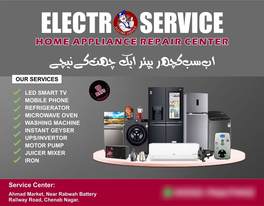
Here the headline is a bold, wide name on a grey background, followed by a subtitle in red italics and an Urdu line. The left side carries a checklist of services with green tick marks, which is easy to scan because each line is short and the ticks create a rhythm. The pictures sit on a pedestal on the right, making the products look organised. A coloured strip at the bottom holds the address and the contact number in white text.
The round badge about a warranty is a useful reminder about honesty. Badges, guarantees and promises are powerful, but only when they are true and when the business can keep them. Never put a warranty, a certification or a brand authorisation on an ad unless the client has confirmed it, because readers remember broken promises.
Example three: a wide banner with an Urdu message
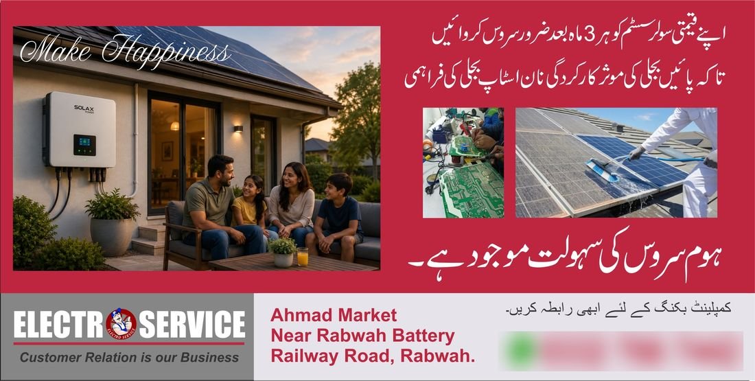
This one is a wide banner, and it relies on words more than on products. A rich red background carries a long Urdu message in white, which gives it strong contrast and a clear voice, with a short closing line that mentions a home service. Three photographs sit in the middle, showing the sort of work that is done, and a light footer carries the brand, the address and the number. When the message is a piece of advice, as it is here, the words themselves are the ad, so the letters must be big and the lines well spaced.
Write a headline that works in Urdu
Keep it short. A headline of five to eight words is much easier to read at a glance than a full sentence. Choose a font that is clear at a distance; Nastaliq looks graceful but needs generous size and line spacing, and a simple Naskh-style bold font is often easier to read on a banner. Give lines room, because Urdu letters rise and fall above and below the line, and tight spacing makes them collide. If you prepare text, our guide to preparing Urdu text for printing covers fonts, direction and checks, and you can draft headlines in the Urdu online editor.
Build a clear hierarchy
Decide the order in which a stranger should read the ad. Usually it is the business name, then the headline, then the proof or offer, then the contact details. Give each level a clearly different size. If everything is large, nothing stands out. A simple test is to squint at the design from a metre away: the shapes that remain should still tell the story.
Use pictures that help, and that you have the right to use
A good image shows the product or the work being done. A pile of unrelated pictures only creates noise. Make sure the images are sharp enough for the print size, and do not stretch small pictures. Most important of all, use images you own or are licensed to use. Photos of famous brands' products, models from stock websites and logos copied from the internet can all cause copyright trouble. If you are not sure, use your own photographs or a licensed source.
Make contact details impossible to miss
The number is the point of the ad, so make it large, high contrast and easy to read. A WhatsApp icon next to a mobile number tells people that they can simply send a message. Keep the address short but clear enough to find the place. Check every digit against the original, because a wrong number wastes the whole print run.
Colour: strong, simple and consistent
Use one dominant colour, one supporting colour and plenty of white or black for contrast. Red, black and white are common for attention, but they can feel heavy if every element is large, so give the eyes some quiet areas. Make sure text always has strong contrast with its background, and check that the ad still reads if it is printed in black and white.
Flyer, poster or flex banner: size changes the rules
A hand-held flyer is read from a short distance, so it can carry a little more detail, such as a short list of services. A poster is read from a few steps away, so it needs a bolder headline and fewer words. A flex banner is read from across the street, which means very large letters, very few words and strong contrast. Ask your printer for the exact size, the file format and the resolution they need, because large formats have different requirements from small ones.
Prepare the file for print
Ask whether the printer needs bleed, which means extending background colour a little beyond the final edge. Keep text away from the edges so it cannot be trimmed. Embed or outline fonts, or export a PDF, so that the shop's computer does not substitute another font. Open the exported file and check every corner, and print a small test copy of a flyer before the full run. For a banner, ask for a proof or a small sample if the printer offers one.
A quick checklist
- One message, written in a single sentence.
- A short Urdu headline in a clear, large font.
- A clear order: name, headline, proof, contact.
- Pictures that help, sharp and properly licensed.
- Honest claims only.
- A large, correct phone number and a clear address.
- Files prepared with the printer's requirements in mind.
Mistakes that weaken an ad
The most common are too much text, tiny contact details, low contrast, too many fonts and colours, blurry pictures, unclear order, claims that cannot be proved and a wrong phone number. Another is copying a competitor's layout so closely that the ad looks like theirs. Your ad should look like your client's business, not someone else's.
Questions people ask
Should an ad be in Urdu, English or both?
Use the language your customers read. Many local businesses use both, with the main message in Urdu and the name and details in English.
How many pictures should I use?
Only as many as help the message. A few clear pictures beat a crowded collage.
How big should the phone number be?
Big enough to read from the intended distance. On a flyer it can be modest, but on a banner it should be one of the largest elements.
Can I use pictures from the internet?
Only if the licence allows it. Otherwise use your own photographs or properly licensed images.
Closing thoughts
A good advertisement is not the busiest one. It has a single message, a clear order, readable Urdu, honest claims and a number that is easy to find. Test the design by showing it to someone for three seconds and asking what the business does. If they can tell you, the design is working. If they cannot, simplify it, and then simplify it again.